… Like a man.

Acrylic Stetson met Banksy in Verona … … he gave Ac.Stet a few words of advice as a fashion exile:
Ah, Ac.Stet can proudly say he is the confluence of upperground fashion and underground art … …
.
.
“Bhutto Returns to Pakistan After 8-Year Exile”
The New York Times, Oct 19 2007
Ac.Stet was right.
This is what he means when he says that it was for important for Glamour Magazine to blurb the exclusive interview by Joseph Braude with former Pakistani prime minister Benazir Bhutto on its cover this month.
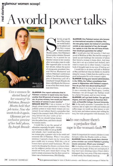
Glamour editors should have the foresight that such a resilient female politician should be in the limelight very soon. And besides, with Women’s Wear Daily, Fortune and Forbes Magazine devoting covers to the rising trend of women in power, Glamour should have been together with these periodicals at the forefronts of identifying such a trend with its exclusive Bhutto interview and used as a coverline.
Meanwhile, elsewhere in the magazine, of a fluffier nature, is another boo-boo.
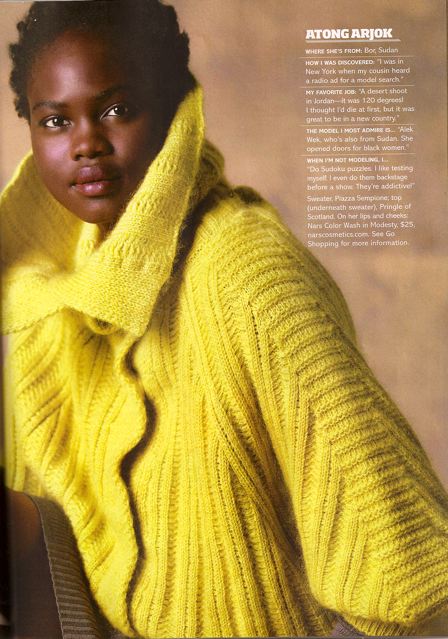
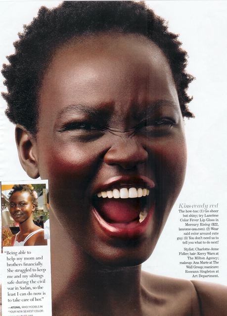
On its fashion spread titled “5 New Sweaters, 5 New Faces”, the model Atong Arjok is used as one of the five “new” faces:
Er, NEW?
Almost a year ago, in Glamour’s December 2006 issue, Ms. Arjok has already been used as a model in a beauty spread on lipstick colors, titled: “Your New Sexiest Color: RED!” This is the said spread where the Sudanese fashion model has a full-page close-up, as well as a blurb on the conributor’s page:
Doesn’t Glamour Magazine keep track of what it has done or not done before?
Argh, the state of fashion publishing these days.

On the outset, Glamour Magazine reminds Ac.Stet of the city of Las Vegas.
Sure, the over-the-top facades of The Luxor, MGM, The Venetian, Treasure Island and so on, look super-grand, ultra-luxe and hyper-glam. But the illusion either stops short of its name, or at its front steps. Let Ac.Stet ask you: Have you ever seen the interiors of The Luxor, that black-glassed pyramid with a single laser that shoots from its apex into the heavens above? Looks grand on the outside, but the rooms are nasty. Or Treasure Island. Ackt.
Having said all that, Ac.Stet must say he still loves Vegas. It’s one of his favoritest cities in America.
Glamour Magazine is the same. Its name says “Glamour”, but it espouses anything but.
The ads are telling of the kind of target audience Glamour courts. You won’t find Gucci or Louis Vuitton prêt-a-porter here. But you will find Dilliards, Ann Taylor Loft, Lauren Jeans Co, . You will however, find Prada and Dolce e Gabbana here – not its apparel line – but its accessories (Prada eyewear) and beauty lines (Dolce fragrance). And speaking of cosmetics, there are tons of them here, ranging from Garnier to – for goddess’ sake, celebrity perfumes, duh.
It is glamour of the celebrities. But the ape is not the way fashionistas ape, say Stella Tennant or Kate Moss. It’s aping the way people will accord Oprah Winfrey. It’s glamour and fashion the way only the woman who buys her beauty supplies from Sally’s Beauty Supply at the strip mall would appreciate. Strictly speaking, Glamour is not really considered a fashion magazine. Sure, it’s glamour and a dose of fashion, but it is dispensed in a way so people who watch Project Runway and reads Perez Hilton (who incidentally blogs for the mag) can understand glam and fash.
You could almost say, Glamour’s really all glamour and fashion, supermarket-style.
But Ac.Stet wouldn’t.
In fact, Glamour magazine deserves a second look and a second read.
Sure, it’s goes full-frontal on Mariah Carey, one of the most massest, mass-mass, mass-consumer celebrities today.
But read the Q&A style interview with Ms. Carey by writer Ms. Carole Radziwill and you will come away with information about Ms. Carey that you may not know for a fact. For instance, it is refreshing to read that Ms. Carey’s rare ability to produce one of the highest human notes has been scientifically recorded at 3+1/2 octaves above Middle C. And it also has some funny bits:
Mariah Carey: I was a little malnourished (singing at the 1990 NBA finals), wasn’t I?
Glamour: Yes, you looked like you weighed 80 pounds. And most of it was hair.
The fact that the piece balances such serious facts with some really hilarious writing, so that the overall story does not come either as intellectually-pretentious (Guilty: Arianna Huffington in October’s Harper’s Bazaar) or meaningless fluff (read: October’s American Elle).
In fact, a part of Ac.Stet. begins to suspect that Glamour Magazine is trying to become the next JANE. After Jane shuts down in July, with its last issue in August 2007, there is a void for sensible-but-savvy women’s magazines that prods real issues that confronts real women, provide fodder for real issues that real women should think about.
With JANE gone and BUST too dyke-ish, Glamour may just be the prime candidate to combine celebrity glamour, fashion and lifestyle teacup features with econo-cultural and socio-political issues.
The signs are promising: The editor’s letter penned by Cindi Leive, is devoted to the mag’s home makeover project in New Orleans (instead of ELLE’s wondering what to wear at a BBQ fete or HARPER’s waxing lyrical about being invited to Diego Della Valle’s Italy mansion) and non-fashion features like battling cervical cancer, and exclusive interviews with Pakistan’s Benazir Bhutto, a daughter writing about her druglord father (5 pages, mind you).
Unfortunately, Glamour’s editors do not seem to realize that their readers may be more intelligent and sensible than wanting to know beyond sex and beauty. How else would you explain the sub-standard coverlines that do little justice to the interesting editorials inside?
Instead, the coverlines that gets printed are yawn-generating. Sample this: (… Are we still living in the 1990s?)
“Every Woman’s Guide to (Mind-blowing, Toe-Curling) Sex”
“The #1 Drug Women are taking and what it does to … sex life”.
“Mariah’s New Attitude… Britney, take notes!”
“Great hair in half the time!”
Ac.Stet says “unfortunately” because Glamour definitely has higher potential than these silly lines.
It should have devoted previous cover space to cleverer and more intriguing coverlines. On Page 227, it has an interesting interview with singer James Blunt. It’s sub-head reads: “…and how [Blunt] sold his sister on eBay.” Glamour should have used this as one of its coverlines instead.
And is there a national security reason why Jenna Bush’ debut as a published writer with a story on a Jamaican woman suffering from HIV? That would have made a compelling reason to buy the magazine if someone sees it blurbed on the cover.
If Ac.Stet has it his way, these would be the coverlines on Glamour this month:
THE HOME ISSUE
Mariah Carey’s Lamb- and Louboutin-filled Mansion!
Rachel Ray’s Hang-out Kitchen!
Rachel Zoe’s Style Studio!
& More Shocking Celeb Cribs!
GO VIVID
NEVER MATCH, ALWAYS MIX!
& More Tricks to Transform Your Home (Page 283)
7 Unsexy Things
That Makes Sex Great (Page 249)
FALL FASHION GUIDE
30 Tips for Top to Toe
WOMEN IN POWER (Text to put in Little Bubble)
TWIN PEAKS
Jenna Bush’s All Grown Up
EX-MINISTER PRIMED
Benazir Bhutto, Exile No More
SOLD, SISTER!
How James Blunt eBay’ed Sis
EVERYONE CAN
Survive Cancer
One Woman’s Story
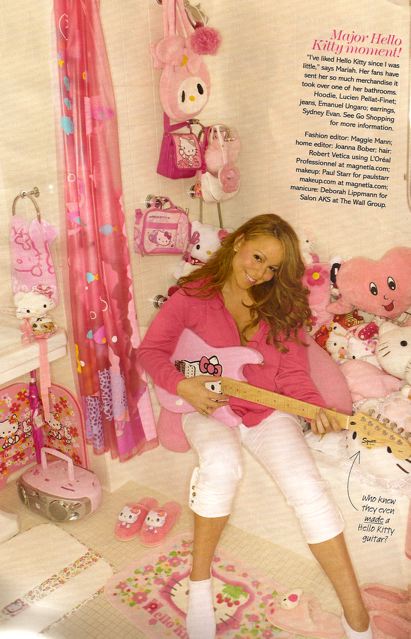
The November issue is themed on Home, which is a more suburban, than urban, concern. Nevertheless, it gives us a chance to look into the inner sanctums of pop cultural people like Mariah Carey (her Helly Kitty collection has colonized her bathroom, oh lordy):
and Rachel Zoe (which is surprisingly b-o-r-i-n-g) and Tina Fey (her other office, for her SNL projects, which was featured in the VISA card advertisement is actually more interesting).
So was this successfully done? Not as it could have been.
But there are hits in the Home theme. The photo-editorial spread on Emmy Rossum’s redecorating project is lovely, as are the house profiles of beauty professionals Bobbi Brown and Josie Maran. This picture even looked as though it could have been taken by Vanity Fair’s Mark Seliger:
And flipping through the fashion pages of Glamour, you may be forgiven for thinking that the modeling industry has gone on strike and its magazine stylists have to hit the streets to source for models, not something even Hedi Slimane would approve everyone to do. There is this pointless spread, a waste of 6 full pages (Ac.Stet. is weeping for the fallen trees), on “5 New Sweaters, 5 New Faces … okay, Glamour, your point being?
And on Page 232, “What looks Cool Now” … well, Glamour, “cool” certainly isn’t your choice of a male model:
If you ask Ac.Stet, looking at these models chosen by Glamour, they should walk the editors’ dogs, mop the floors with Q-tips, fetch macchiatos before Ac.Stet would even let them near a rack of clothes. What kind of expressions and poses are those?
And then there are the product pages. What – in Grace Coddington’s name – are these metal rulers and tape measures doing in a page like this?
Whoever styled this page, approved of such a page layout, and photographed this god-awful page and the aforementioned pages . … should be given over to brand managers at Barneys, dressed in 14 layers of discounted clothes, let loose on the shop floors during their warehouse sale, and then ignore their pleas as hyperventilating shoppers rip the steals off their bones in their frenzy.
The last page (Page 300) on “Dos and Don’ts” is given to designer Michael Kors, who is still deciding whether he wants to be the next Calvin Klein of fashion, or the next Simon Doonan of go-to professional-gay-man whenever some lazy or resource-poor journalist wants a quote.
Together with ELLE’s Nina Garcia, Michael Kors should never be allowed to leave his design studio and go anywhere near a keyboard. Mr. Kors is prone to using the same words repeatedly, in this case, the word “too”. This is often symptomatic of bitch-writing, to actually mean anything useful. Sample how he writes:
“That’s TOO retro.”
“… You’ll end up wearing it on your jeans, TOO!”
“Don’t do matching-shade accessories – TOO Dynasty!”
“Don’t overdo … by zipping … into a TOO-tight or TOO-cleavagey number… you don’t need the dress to scream it TOO.”
In all, Glamour could reach higher ground by educating its readers of aspirations beyond celebrity-glamour and cheap-fashion tricks.
Like Ac.Stet said before, it could be the next JANE.
And methinks Conde Nast knows that too.

.
Names often fool.
.
But if moneys and longevity are at stake in a fashion game of changing trends and whimsical consumer fancies, then a good name – preferably not your boring own – should be used as a talisman to tide over the capricity of the business.
if you think you know your fashion history, and fashion pseudonym trivia, then let’s play Jeopardy!
===>
In 1971, a young designer held his very first fashion collection show at Paris Fashion week under the label, Cafe de Paris. His name, long dissolved of its ready-to-wear and only exists in an angelic line of fragrances and cosmetics, is now more associated with Cirque du Soeil. He is …
.
.
.
.
.
.
.
.
.
.
.
.
.
.
.
Thierry Mugler.

Can some kind soul please tell Ac.Stet the significance of Ms. Eva Chow’s hand gesture. Perhaps it is fortunate she raises her left hand instead of her right … otherwise, the semblance to this:

and the ripple effects of this print ad for Poltrona Frau would have been very fatal.

So the Council of Fashion Designers of America CFDA has again banded together several fashion retailers to raise awareness and funds to support medical research, screening, education and patient care. Ac.Stet likes the fact that it is a noble effort, which began in 1994, on the part of CFDA in lending its gloss to philantrophic do’s to the less fortunate.
Although, as all fashion media goes, Ac.Stet is acutely aware the repercussions of putting out such a print ad. The image composition is magnificent, all long-limbed nymphs in bikini bottoms. And in limited color blocks.
Ac.Stet’s not just talking about the color of their baby-tees. There are whites (model Sasha, Daria Werbowy, Lily C, Lily D), and er, yellow/olive (Chinese import Du Juan).
So … where’s the black rep? Or a Hispanic rep?
Ac.Stet is not being nitpicky here.
Come on, in FTBC’s case, if Fashion REALLY targets breast cancer, they would have done due diligence on the medical condition that accounts for 2% of all deaths nationwide and would have known that:
African Americans, Native Americans, and Hispanic whites are more likely to be diagnosed with advanced stages of breast cancer tumors than non-Hispanic whites and Asian/Pacific Islanders.
Japanese and Chinese females have better breast cancer survival rates while Hawaiian and Mexican women had 30% poorer survival rates when compared to non-Hispanic whites.
African Americans, Native Americans and Hispanic whites faced a 10-70% greater risk of death after a breast cancer diagnosis as compared to non-Hispanic whites.
The figures are taken from a 2003 study undertaken by the Fred Hutchinson Cancer Research Center in Seattle. Data from 125,000 women representing all major racial, and ethnic populations and subpopulations, in the US were evaluated. Data for the study came from 11 tumor registries that are a part of the National Cancer Institute’s SEER (Surveillance, Epidemiology and End Results) program.
A more recent study, published this year in the Sep 15, 2007 issue of CANCER, a peer-reviewed journal of the American Cancer Society, echoes similar results mentioned in the 2003 study. (Please visit website: “Racial Disparities In Breast Cancer Survival Persist” , http://www.medicalnewstoday.com/articles/79638.php)
So, for this FTBC campaign – and others before it – why are white and almost white fashion models used to represent the fight against breast cancer, when the very women they are trying to help are of skin tones distinctly remote from theirs?
This is surely a gross misrepresentation of reality. Has the campaign overlooked substance for style? … … Perhaps, just perhaps …. the campaign’s press agency, KCD, must be screwing up again.
_________________________________________________
Side note:
And oh, for those of you interested, if you visit the main website for this cause, www fashiontargetsbreastcancer dot com, you will spot another HUGE boo-boo. Right at the bottom of the homepage reads: “©2005 FASAHION TARGETS BRESAT CANCER, CFDA FOUNDATION”.
Er, what’s this new medical condition called bresat cancer?

Who – in Gabrielle Coco Chanel’s name – would ever want to wear an Unforgivable Woman?
It makes it even worse when you realise that Sean Puff Diddy Combs’ new fragrance is for women. So women wearing Unforgivable women, it doesn’t make much scents – oh, sense – to Ac.Stet.
But it joins the growing list of increasingly ridiculous names celebrities slap on their fragrance endorsements. Some of the names just leaves you flabbergasted. What are they expecting consumers to think as they spritz themselves?
“Cumming” (seriously?!) by Alan Cumming (“Honey, you smell like you are cumming.”)
“Coast-to-Coast” by the Olsen Twins
Taste by Jessica Simpson.
Still by Jennifer Lopez.
Toxic by Britney Spears …. oh, wait, what? Oh, that was not a perfume, Ac.Stet was just told. Wonder what the actual name of that perfume is. Just curious.
(If you wish to contribute to this list with names Ac.Stet has missed out, please do post ’em).

*
The October issue of Harper’s Bazaar is, as usual, a spritz of clean. You will appreciate the purity especially after coming away from October’s American ELLE (see previous review), which was really a bad case of editorial cloy.
[But of course, Ac.Stet is not trying to compare Bazaar and ELLE, as they target different readers: Ac.Stet feels ELLE targets a younger girl, just out into the workplace and not sure of who she is, just as ELLE isn’t really sure who it is after its revamp in September. Bazaar targets a woman over 35, who is more mature, more secure and has a higher income bracket to afford to even begin to dream about the couture featured on Page 126.]
The cover stars Mary-Kate Olsen in Gucci. And if you are a subscriber, luckier you: subscribers get an even purer cover with Olsen perched in top-of-the-line Ralph Lauren. The only line of text you get is “Heavenly Fashion” … ah, divine simplicity.
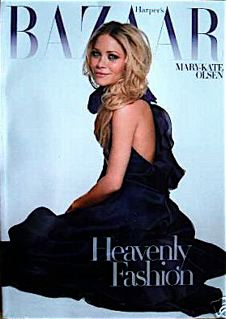
The coverlines are bold, short and succinct. The October theme is Age, and how to look good at every stage. Okay, we get it. Quickly. As the Prada-wearing devil Miranda Priestly would say: That’s all.
The only bone to pcik with the cover is the girlie font (Ac.Stet suspects the Bazaar font is either Minion or Arno). It may be better with a cleaner font like Verdana, to keep with the new clean-and-lean spirit of the Bazaar style.
Let’s dig in.
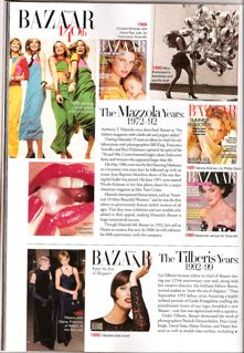
Did Ac.Stet miss something or did Bazaar dove into its 140th anniversary walk-down-memory-lane section without any warning? There was no preamble, no sub-heading to prepare readers for what they are about to read and all of a sudden, after a barrage of ads on Page 80, readers get an avalanche of “the Mazzola Years”, “the Tilberis Years” and “the Betts Years” … all this even before the content pages. Tres Bizarre.
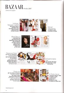
And the content page is always lovely. It is not alike any other magazine that simply bunch up the list of contents in one box and shepherd the accompanying visuals into another corner. No, the Bazaar look is uniquely, well, Bazaar: All rows of lovely diminutized pictures of the spreads ahead, with columns of short-and-sweet feature titles. It brings to mind how you would organize your walk-in closet: to remind yourself which shoe is in which box, a Polaroid is tacked to the front of each box, with a short description to tell you what’s beneath the lids. A very effective brand signifier, if Ac.Stet may say, that stamps the Bazaar look.

There is something about the effectiveness of color that must be said. On the Smart Shopping pages on Page 183, the palette of forest greens and moody purples not only works aesthetically but immediately puts a clarion cry that fall has come.
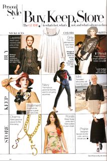
On Page 200, there is the eye-joy that is the Buy-Keep-Store section. Pages like these are an industry standard practice where as much freshly-launched product news as possible are put out. It is always a arduous test of spatial dynamics because the sub-editor has to juggle catwalk pics with product etch-outs, fashion spreads, paparazzi shots, red-carpet shots and text … all these on an 8×11.The Buy-Keep-Store utilizes a grid format. Okay, nothing ground-breaking but not many people know how else to maintain the balance, keep the page clean and most importantly, draw people to read it without turning them off from potential clutter (American ELLE, take note.)
Page 229 launches into the cover theme: Fab personal style at every age. While ELLE also themed its October issue with personal style, Bazaar does it 10 times better because of the age breakup, good writing and better page layouts. And it even has 9 quick-tips for how to dress in timeless style, which makes the Little Black Book of Style by ELLE’s Nina Garcia completely redundant.
One thing Ac.Stet realizes about Harper’s Bazaar is that it actually has pretty readable fashion feature stories. Of course, the level of intellectual discourse is not on par with VOGUE. The Grey Lady or The New Yorker, but it does analyses fashion phenomenon by delving somewhat into academia, but not too much as to turn the average reader off. Harper’s Bazaar treats fashion seriously but not to a point where it becomes rocket science.

On Page 219, stage actress and Arthur-Miller scion, Rebecca, writes about her obsession with shoes – beautifully illustrated with delicious Giuseppe Zanotti wedges. Although Ac.Stet never had the satifaction of wearing women’s heels, he does empathize with the talismanic power Ms. Miller writes about whenever he trots about Milan in his Jil Sander by Jil Sander (not Vukmirovic or Simons) boots, or his Ferragamo sneakers, or his Giorgio Armani boots, or his …
On Page 253, the ubiquitous Simon Doonan – who is quoted anywhere and everywhere from Paper to Out Magazine to New York Post – writes a really original piece, “Are Your Clothes Aging You?”
Ac.Stet remembers in another fashion editing life how difficult sometimes it is to plough for story ideas on fashion. It really takes real talent such as Mr. Doonan, whose professional and extra-curricular experiences as retail veteran, window-dresser, witty industry observer and full-time gay man, to really come forth with such great stories. Ac.Stet applaudes Bazaar in snagging him as a columnist.
Mr. Doonan talks about how in fashion, psychography now determines demography. Following which, not being tech-savvy like hulking over your Blackberry, instantly ages you well beyond your years. And then he says not having a MySpace account “ages” you the same way. To that, Ac.Stet must say, oh my god, sweetheart, you are really either very old or very out-dated. Not knowing that Facebook is the new MySpace, is the same as not knowing Chelsea’s the new Soho for art folks.
The trap most fashion writers fall into when they try to bring discourse into fashion stories is when they try to force it. This is unfortunate because either the resultant story makes no sense, or equally worse, the story comes away feeling rather pretentious.
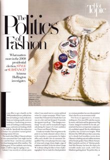
Such is the case with the article Arianna Huffington wrote about “The Politics of Fashion” on Page 287. Huffington, the blogger who refuses to acknowledge that she is a blogger (Financial Times, Oct 2, 2007), writes about how politicians are increasingly dressing better, spending more and engaging professionals to help them look more appealing to voters and the media alike. But by focusing on John Edwards’ $400 haircut scandal, (newly minted Nobel Prize winner) Al Gore’s waistline and Condoleeza Rice’s Ferragamo spree during Hurricane Katrina, Huffington is not really writing about the politics of fashion, is she? She’s writing more about “The Fashion of Politics”.
Of course, saying “The Politics of Fashion”, rather than “The Fashion of Politics” definitely makes Huffington sound more intelligent. But the reality is, it does not. Politics of fashion is the domain of people like Katharine Hamnett, Teri Agins, or even New York Times Guy Trebay, who is more a social critic than a style writer.
Especially when Huffington writes like this:
“It made me wonder: Have we gotten to the point in our looks-obsessed culture where a svelte waistline is a prerequisite for higher office and a double chin an automatic disqualifier? Has a trim physique become a sign of virtue and cottage-cheese thighs a sign of indolence and sloth? Is this the reason …? Are we ready for a black president or a woman president but not a fat president? How’s that for an inconvenient truth?”
Why does she want to channel the annoyingly rhetorical Carrie Bradshaw from Sex & The City? Wouldn’t she rather want to adopt a more grown-up prose like that of, say, Sara Gay Forden in dissecting the murderous politics of the Gucci empire?
Moreover, Ms. Huffington dearie, shame on you – online political commentator, you – for saying that we Americans are not ready for a fat president. I mean, what do you think Americans were readying themselves for when John “His Rotundity” Adams, William Howard “Big Bill” Taft, Theodore “Teddy Bear” Roosevelt, Grover “Stuffed Prophet” Cleveland were in power?
Miss Huffington, please stop.
Other things that shouldn’t stop are the Olsen spreads. Here’s one, not really representative of the entire shoot. With her orange hair, Mary-Kate Olsen does resemble a dwarven Patricia Field or a nostalgic French child prostitute:
Anthony Wards’ picture spread is nothing interesting except for the stark but haunting beauty of Daria Werbowy on the opener:

Elsewhere, it’s the usual pout-and-skulk pictures.
Where are the standouts, you wonder.

.
Names often fool.
.
But if moneys and longevity are at stake in a fashion game of changing trends and whimsical consumer fancies, then a good name – preferably not your boring own – should be used as a talisman to tide over the capricity of the business.
if you think you know your fashion history, and fashion pseudonym trivia, then let’s play Jeopardy!
===>
In 1970, Takada-san, a young fashion illustrator to Louis Feraud and French ELLE from Japan opened his first shop retailing fresh-spirited clothes in a space entirely decorated with jungle prints. The shop was called Jungle Jap. Six years, later, imbued with his own Far East heritage, in particular the traditional kimono, Takada-san finally launched his own label, this time, using his given first name:
.
.
.
.
.
.
.
.
.
.
.
.
.
.
.
Kenzo.

Ac.Stet has never seen a reality TV show sink so low.
VH1’s “America’s Most Smartest Model” is one of those programmes that makes you wonder if the world is really coming to an end.
VH1 claims “America’s Most Smartest Model” is a search for the country’s brainiest model and to prove that these models are not just well-endowed glamzons.
But one suspects that the real premise of the reality TV show is another story, and also extremely simple: Make these fashion models look as stooopid as possible.
And these fashion model-want-to-be’s are all willing to sacrifice dignity for fame, and maybe an iota of an opportunity to prove to the viewing world that models are not stupid.
But really, Ac.Stet feels, this is a no-brainer. We expect politicians to be wise, we expect scientists to solve problems, we expect football players to score and we expect fashion models to pose prettily.
Right?
But do we expect politicians to pose prettily (ok, besides John Edwards)? Do we expect football players to debate policies on CNN?
So, what’s the point of getting fashion models to prove something they were never meant for?
Ac.Stet doesn’t care if fashion models are stupid, as long as they can produce a beautiful picture in a magazine, or bring out the essence of a dress on a catwalk.
But as aforementioned, VH1 has really sunk that low for that kinda cheap thrill of watching pretty people fall.
And it’s also guilty pleasure for us all who just want a hack of a laugh from a mindless TV show about mindless pretty faces. How can we not be enticed to be mindlessly entertained with easy-crap like this?
Ah, but what keeps people glued to the programme are impossibly beautiful faces like these:
Meet male model Slavco …

Slavco has many print work in his name and he was nearly chosen to appear in one of those iconic Abercrombie & Fitch ads, but was later told he was “too chiseled” and was dropped instead. Well, if we are that beautiful, we really wouldn’t mind being told that we are “too chiseled” for the job. Getting criticized like that, to borrow a phrase from The Merovingian in The Matrix, is like wiping your arse with silk.
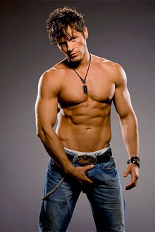
But the show apparently has a huge soft spot for another mal model contestant: the bred-like-a-Greek-deity Brett:


The camera finds no problem with lingering longingly at his meticulously etched-out, laser-cut abs:

again (paired with another Prada model, Jeff “Pickle” Pickel) …

and again ….

and again …

and again ….

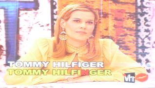
Take a look at these screen caps for the maiden episode that puts the models through a gruelling spelling bee.

The expression on their faces is hilarious, and if you must have maximum comedic effect, Ac.Stet suggests you watch the entire Spelling Bee segment with the sound off. This way, you can really see the full effect of placing the words “retardant” and “nincompoop” beneath the models’ faces. Remember, the producers are all out to make these poor souls look stupid.
Jeff Pickel steps up to the challenge with the word “Electrolysis”. With a beautiful face like that, why does he need to know about such scientific jargon?

The same goes for V J and Brett, two of the more gorgeous faces in the show. I mean, “Isaac Mizrahi”?! is VH1 training him to be a fashion journalist or a merchandiser? He’s a male model, for heaven’s sake!

Oh … Awwwww… Look at Brett, he’s ooh-cutsey-cutsey-cute-cute-ooh-oh so embarrassed!

But you gotta hand it up to them for the cheap laughs: Male model V J trying to spell “chiffon” … er, Shaffawn, anyone?

And sometimes, you get the feeling that the VH1 producers just want to get a chance to pin the words “retardant” and “nincompoop” on these pretty boys … Ac.Stet’s guess is, this is a case of the Revenge of the Nerds. These same VH1 producers must be ugly, fat, average-looking people out to seek vengeance on pretty people, who must seem to have it easier in a world that is naturally cruel to the physically ill-privileged.


But of course, host Mary Alice’s expressions at some of the misspells is classic:
Nincom-boob?


Tommy Hilfinger?

Speechless
Who knows, simply by making Abs-god Slavco Tuskaloski to leave the reality show at the start, VH1 may just have unwittingly made him America’s smartest model. Here’s another look at this impossibly beautiful creature … Which just begs the question: Why does anyone even care if he is smart or not?

In the fashion publishing world, the months of October and April for magazines are always considered slack-offs.
After all, the months before (September and March) are almost-always bumper issues devoted to the Spring and Fall collections. Advertisers go into headless-chicken frenzy mode in buying up ad pages, in turn driving up the quality of content.
So when it comes to October and April, magazine editor-in-chiefs tend to shepherd their stable of writers, editors, photographers and stylists with one shut-eye and one hand desperately pinching their pores together so the air won’t shoot out of their deflating balloons.
Still, it is NO excuse for ELLE magazine to be publishing a flawed edition this month.
Just read this sentence in the Beauty Section on Page 302, where the writer quotes a skin doctor about the wonders of ginger as a cosmetic ingredient:
” ‘Ginger is one of the most complicated compounds in nature,’ says XXX. ‘It’s made up of an enormous number of components.’ “
Er, yes, how illuminating. And do you know, Ac.Stet is also his father’s son?
If your intelligence does not feel insulted already, Ac.Stet would indeed be very worried for exactly who ELLE thinks makes up its readership demographic.
And the fashion miracle is that this quote actually passed through production into actual print. Why it is considered deserving of quotation is simply beyond Ac.Stet’s comprehension. And perhaps the writer could have redeemed herself by telling us exactly how many components and why else, is ginger such a complex root.
And take a look at this page:

And let us enlarge the portion Ac.Stet wants to draw your attention to:

What – in Queen’s English – does this convoluted sentence mean? ==> “What I Wore speak, memory, of what we had on when we found the courage to break up, act out, and define ourselves through clever sartorial statement.”
Anyway, those above were just to prepare you for what’s to come in the October issue of ELLE.
Since it’s revamp in September, ELLE has given off the impression that it wants to be like VOGUE. But like a half-made flounce dress, it has the shape of things to come, but not enough crinoline to hold up the bustle. As a result it falls flat.
ELLE tries to be too many things at one time, like an eager-beaver boy-scout wanting to display all his medals at once, including those for being able to tie his own shoelaces.
Take a look at the cover, as well as the months before this, and you will have an idea of the mess ELLE has created for herself:
What is the point of having so MANY coverlines? If they scream out at you for some worthy cause, all fair and good. But for things like “440+ Pages of Shoes, Boots … “? Sweetheart, Ac.Stet just returned from Milan Fashion Week where ELLE Italia comes few pages short of a 1,000 pages. What’s 440+ pages worth screaming about? It’s now pretty standard for fahsion magazines to be over 300-pages, ain’t it?
There is so much clutter, like some festering kudzu, that even the ELLE logo itself is not spared the sanctity of space:

What. Is. That? Why does the editor feel a need to tell us about some “Total Body Redo” jabbed in-between the masthead logo?
Let’s get into the contents.
The October issue asserts itself as “The Personal Style Issue”, its second attempt, since last year’s.
Wow. Personal Style. Ambitious, aren’t we? Personal style is one of the most salient phenomenons of individual fashion beginning in the late 1990s. It began with the movement of abandoning the top-to-toe in one designer look and catalysed by the dot-com boost to casual-as-formal wear. It simply means, anything goes, as long as it goes with you.
A hefty promise. But never delivered. Instead, ELLE tells its readers, as with previous months, what the runway trends are and what there are in the shops. And then on Page 233 “Personal Style 101”, it proceeds to tell you to dress like, er, models like Twiggy, Jean Shrimpton, Veruschka, Brooke Shields, Bianca/Jade Jaegger, Jerry Hall, Agyness Deyn, Giselle Bundchen, Daria Werbowy, Cindy, Christy, Naomi, Linda …
Since when is Personal Style about copying trends and imitating celebrities?
Ac.Stet is not one to just bitch and rant without providing alternatives or more plausible solutions. Look, any experienced fashion person will readily tell you that “Personal Style” as a theme is more tricky than it looks in writing. The most recent statistic puts ELLE’s monthly readership at 4.9 million. Can mere 44o+ pages personalize fashion for each of its 4.9 million readers?
So what is Ac.Stet’s suggestion?
Fashion Publishing – especially for mass titles like ELLE – can never be about Personal Style. If it can be, then all the major fashion companies that advertise in magazines will go bust because everybody wants to dress like Annie Hall or Anna Piaggi, i.e. styles that speak-only-to-oneself and never in trend. So? Don’t ever do any magazine issues based on “Personal Style”. It will never work, and you can never make it work to personalize it to each of your reader and worse, it will make the magazine sound incredulous and look stupid.
But of course, Ac.Stet understands the power of hyperbole in fashion publishing. Sure, it sounds yay-yay-Great when you scream “Personal Style”. But when ELLE doesn’t even seem to take much effort outside its tried-and-tired paths of defining fashion as only those things models wear, you cannot help but feel shortchanged. ELLE should take a leaf from VOGUE. When Vogue does personal style issues, it breaks the concepts “Personal” and “Style” down into more comprehendable “Shape” and “Age” themes, which are so much more value-add to its readers. Beyond editorial creativity, that is what we call Readership Respect.
And of course, we all know why ELLE chose Personal Style as its October theme, don’t we? It’s to coincide with the launch of fashion director Nina “Project Runway” Garcia’s maiden book: The Little Black Book of Style. This forms the crux of her monthly fashion column started Sep 2007, called FashioNina.
Which brings Ac.Stet to his next gripe: Er, so Miss Garcia, what new things about style can you tell us about building personal style? Well, she says, invest in wardrobe staples like a little black dress, white shirt, trench, bag … er, actually, that did not come from Ms. Garcia’s column. Ac.Stet lifted those items straight from TheFashionSpot, or FabricOfOurLives, or hell, any style blog or site, which will tell you more-or-less the same things …
So is Ms. Garcia contributing to the truckloads of fashion how-to books out there, or does she really have anything value-added to say? Ac.Stet. leaves that opinion up to you.
And her book/column is littered by quotes on style by illuminaries like Yves Saint Laurent, Michael Kors (of course, her Proj Runway comrade), Karl Lagerfeld, Giorgio Armani and so on … but didn’t your grade-school writing coach told you before that the over-use of quotes just mean you don’t have anything original to say for yourself?
It also doesn’t help that Ms. Garcia is not a very interesting writer. She latches onto certain adjectives and adverbs and uses them repeatedly. Like, the little black dress is “mysterious”, the trench coat is “mysterious”. And then she likes to use alot of “alluring” and alot of “chic” .
She also feels [Denim] gives you “instant style”, [Trench] makes you “instantly mysterious”, and [Cashmere] is “instantly luxe” … how Ac.Stet wish Ms. Garcia “instantly” enrols herself into some creative writing class.
Look, Ac.Stet has nothing against Ms Garcia. In fact, methinks she is hugely entertaining on Project Runway talking about design and methinks she has done a great job over the years directing fashion at ELLE. But why give Michelangelo a nail brush so he can paint nails? Why make a person write when she is clearly better at doing something else? Nina, Ac.Stet. feels your pain of added unnecessary responsibilities.
But speaking of bad writing, ELLE has alot of those. But you will notice in all, there is a certain pattern. A pattern that mimicks the visual clutter of the magazine: too-many words squeeze into one sentence such that essence and intelligibility are lost. Let’s see …
On Page 144, “Style Insider” speaks to Dominican designer Miguelina Gambaccini. The writer Alexa Brazilian wrote:
“Gambaccini’s inspiration and muse accentuate her gravitational pull toward tropical hues: the beaches of Las Terrenas in the DR and model and friend Astrid Munoz, whose bronzed beauty is a fitting complement to the Miguelina look.”
Excuse me? Ac.Stet is drowning in the sea of transitions and clauses. Ms. Barzilian does not seemed to be reigned in as she continues to ramble on in another story on designer Sylvie Cachay, chasing the full-stop for 76-words before allowing her readers to breathe:
“Such a specific vision isn’t surprising in a woman who sneaked into the front row of the Chanel couture show the year she was studying fashion design in Paris, started her career as an intern at Marc Jacobs, quickly climbed the ladder at Tommy Hilfiger from assistant designer to head designer of women’s wear, and finally landed the head swimwear designer post at Victoria’s Secret before starting her own line og bathing suits this past summer.” (76 words in 1 sentence!? My, what big lungs you have, Ms. Brazilian.)
Later on, she writes about the designers of Poltock & Walsh:
“Hints of German singer and ’80s icon Klaus Nomi’s structured, color-blocked stage getups can be found in a gray high-waisted swing miniskirt, with triangles of rich raspberry, lemon, and hunter green paired with a crisp, collar-up cottonshirt; a silk fuschia backward bow dress in raw silk.”
That 70-word-sentence aside, Ac.Stet don’t see anything that resembles Klaus Nomi. Unless of course, this is a case of one of those writers wanting to show-off knowledge but applying them in the wrong place.
Moving on.
As an indication of why ELLE fares the way it does, we always look for clues in the masthead. And we may also read the Editor’s Letter, written by its chief, Ms. Roberta Myers. She talks about the most boring of all calendar events: a backyard barbeque, star-studded doubtlessly. And then comes the requisite name-drops: Derek Lam, Arianna Huffington, Rudolph Giuliani, Kate Spade, Dylan Lauren and at least 13 other names …. which really begs the question: Why?
Later she writes of her anxiety about not knowing what to wear to this event and eventually, she ends up with a BLACK Calvin Klein dress. As if to open a trapdoor for herself, she wrote that she does wonder about her choice: Who wears black on a Sunday afternoon in the summer? And as with all trapdoors, her means of a two-prong escape came in the form of her husband – poor man – who has to indulge in Ms Myers’ delusion by coddling to her: “It’s your look.” Your look, she repeats. What could be more personal than that, she smirks.
If having “a look” — by sole virtue of it being personal — is supposed to be beyond reproach, why, Ms. Myers, do you think so many TV makeover programs are so popular?
But okay, let’s take a look at your Look, shall we, ELLE?

Clutter-clutter-clutter … if this image is used full-size, you wouldn’t even be able to see the numerals 1, 2 and 3.

Ac.Stet wants to know, what is this god-awful picture doing in a high-fashion magazine like ELLE? Using photo-wires is the domain of budget newszines. Or publications more concerned with breaking news, research content and immediacy, with style being of secondary concern. What is ELLE thinking?

Clutter-clutter-clutter … Look at this close-up:

The editorial text is fighting with the actual words on the product label in the picture. What is the reader suppose to read? This is visually confusing and visually uncomfortable.

Another god-awful photograph used to illustrate a story … Oh my god, if Ac.Stet were Dolce or Gabbana, Ac.Stet would definitely ban ELLE Magazine from ever borrowing the clothes again. The iconic crushed-metal chastity-belted dresses are being used to illustrate cellulite-laden legs. It certainly doesn’t help that this photo is neither flattering, nor ironic in the styles of Terry Richardson or Juergen Teller.

And this is truly a classic example of contradiction. ELLE says this October issue is devoted to “Personal Style” and so far, this is the only true story that really teaches readers about personal style. The story follows designer Alice Ritter for 21-days, tracking what she wore each day, in a bid to unveil tips on how to dress fashionably for 3 weeks … and what do we get? Pictures of each look that are as small as a Lilliputian, and readers are supposed to learn from these microscopic details? The magazine should at least have packaged a freebie magnifying glass from Swarovski’s optics division with this issue.
.
.
But ELLE is capable of breathable space. Look at these:
A clean example of effective page design. Predictable, yes, but it at least shows how Alice Ritter’s 21-day wardrobe should have been scaled:

And it is possible to have alot of items in the same page with different colors. The trick is that, no matter how diverse the elements, they must work. Fashion is about underlying systems and ultimate clarity. Look at this page (although Ac.Stet frown at the kiddish expression “Cartoony cool puff pieces”.)

And finally … ah, tranquility … :

So you see, ELLE can do clean as well, but just not as often enough as it should. Newly appointed creative director Joe Zee has done a great job of enforcing a clean palette at least, for the fashion photography pages. Ac.Stet is not sure if what he is doing is conscious of trying his best to balance the clutter in other parts of the magazine, but at least somebody is doing it.
But the format of the magazine begets bewilderment. The text heavy sections are claustophobically jam-packed into the first 385-pages, and the remaining 20-odd pages are given the spacious format of fashion spreads and physique-driven editorial. It resembles a half-used tube of toothpaste: all the density at one end, and pittance at the other.
In the same way as clean pictures, ELLE is capable of clear writing too. For instance, Holly Millea’s piece on covergirl Reese Witherspoon is truly an enjoyable read. Ac.Stet calls it a “piece”, because honestly, there isn’t much writing. Reese’ bubbly personality and soundbites pretty much carried the story itself.
But that is how a fashion magazine should be: to let the subject matter speak for itself, whether it is beautiful clothes, beautiful products, beautiful photography or just talented personalities babbling their heads off. Words — especially when they are used to perpetuate the ego — become unnecessary.
For ELLE, this magazine must master the use of space. Its management of page space is inconsistent, sometimes great, many other times off. A huge part of fashion editing lies in creating a visual identity for the magazine. That inturn hugely hinges on finding that X-factor mix of visuals and texts, color and space. If that is not corrected, everything is lost. And yes, that includes your readership.
At some parts of the mag, there are just too many, too many texts … why is there such a drive for the ELLE writers to write so much, especially when the words are either not necessary, or have poor standards of narration? The clutter of words is to a point where it is fighting a bloody battle with the pictures. It gets so bad that they cancel each other out in terms of aesthetic appeal. In other parts, it so severely changes into bare-space fashion photography that the sudden burst of oxygen actually makes it hard to breath, a little like coming up for air after a long bout of near-asphyxiation.
To criticize ELLE is not to wish ill of it. In fact, we all need ELLE. The industry needs ELLE. ELLE is necessary because it counters other heavy-weights like VOGUE, W, GLAMOUR, ALLURE and HARPER’S BAZAAR and so on.
But it needs to convince readers in the new millenium that it does and still does have a unique point of view. To truly come off its 1980s cocoon and be truly of-age in the 2000s, it has to realize that fashion journalism, can never be passed over in place of fluff.
Let’s go, ELLE.
Enough of waxing lyrical about men in uniforms.
It was certainly refreshing in the morning to switch on the TVBox to see Whoopi Goldberg hosting The View in a black admiralty jacket, resplendent while framed by austere-looking epulets, frog buttons, and all outlined and piped in white.

As Clothedom theories go, Ms. Goldberg is a study of fashion as weapon, used to claim/reclaim power.

See the gaggle of women crowding around the table trying to get a word in that is the idle-ladies-who-lunches-and-throw-punches format of ABC’s The View: Onwards of Ms. Goldberg on the far left, there is Joy Behar, Elisabeth Hasselbeck, Sherri Shepherd and the unshakable Barbara Walters.
The View, as in any other multi-host/mutli-compere TV variety show, necessitates juggling various different personalities (or lack of) to find that balance that will round off the show properly (e.g. Queer Eye For The Straight Guy rely on distinct gay stereotypes).
Sadly for The View, after the departure of Star Jones and Rosie O’Donell, there is not much personality left in the gaggle … so those women with the least interesting personalities, have to be put right smack in the centre of the table (i.e Behar, Hasselback, Shepherd) so that these shrinking violets won’t wilter away in the combined might of Ms. Barbara Walters and Ms. Whoopi Goldberg.
The flip-side of this is that both Ms. Walters and Ms. Goldberg has to be removed from the visual gravity of the TV screen and put to the sides of the table, flanking their other three half-baked colleagues.
But both Ms. Goldberg and Ms. Walters are not about to let themselves think that their own clout and personality are enough to remind their audience that they are still “there”.
Look at what they are wearing. Ms. Walters, at far right, has the good mind to wear White, the brightest of all natural colours. Because White lightens all and neutralizes all, it commands a second, third, hey manymany consecutive, looks. And yes, we do look at her often times during the show. We cannot help it. White is might.
And then, may because they already own the centre space, Shephard and Hasselback wear forgettable flower nothings, cultivating and exploiting that “Yoohoo!-I’m-female-and-feminine-and-please-look-at-my -long-beautiful-hair-and-okay-sometimes-my-breasts-while-you-listen-to-me-get-an-intelligent-word-in” look.
Further down the flanks is Joy Behar (who is not seated centre) who tries to recapture some of that lost authority by wearing leather. Ah, that fabric of fashion warriors and urban commandos, out to fight-tooth-and-nail for some corporate prize like, er, recognition and ratings.
But the triumph rally belongs to Ms. Goldberg. The leather-clad Behar may battle all she likes but Ms Goldberg commands. Her severe black admiralty jacket does all the work for her. The military connotation of her costume immediately brings to mind – not a commando – but a commander.
Even when they change positions to interview “Bionic Woman” Michelle Ryan, Ms. Goldberg’s seating arrangement remains unchanged. Armed by all the intelligent fashion choices, Ms. Goldberg is secure in her left-flank position.

Like a general who has found the right bastion from where to plot his next attack, and to gather his strengths, and finds no need to change vantage point. Ms Goldberg’s admiralty jacket is authority.
Yet another shrewd practitioner of Clothedom. Captain Whoopi, je vous felicite.

Clothedom plays a vehicular role in structuring a work of fiction.
A story, a character, a plot revolves around a piece of clothing. But that piece of clothing is no long a piece of clothing. It is not just something worn, but something symbolised. It transcends into something bigger, something metaphorical.
A garment becomes a solipsis of something bigger. It may suggest some gamut of meanings, a certain social cache, a personal tick, a motley of agendas, sometimes a projectile of the wearer’s inner vested interests, a shorthand for stereotypes. Sadly, in most cases, usually in the hands/ pens of lesser writers, clothes (and the expressed knowledge of brands) is simply a superficial exercise in name-dropping, maybe even an excuse, or a certain pretension to cover-up for a lack of a deep understanding of how clothedom really works (they are out there, Ac.Stet. just have never bothered reading bad literature that use fashion references).
And sometimes, when used effectively, fashion becomes the fiction. How, bin such a way that if you remove that piece of clothing from the narrative, the story stops working anymore. And thus, says Zarathustra, Clothedom becomes Cloction.
In one of the earliest tales known to fashion-loving Man, brothers Jacob and Wilhelm Grimm Hans recount and censure the tale of the Little Red Riding Hood (originally written as Little Red Cap — but how in the world are the fashion folks supposed to relate to the morrible cap, relegated to Dutch trucker lowness? — and then so…). The female protagonist is not known by a human name, but christened after a common household garb. Because it is used as a name for a fictional character, it disappears into the vernacular of the narrative, a fairy-tale much less. Little Red Riding Hood is not only, in the strictest sense, nameless, but by virtue of the shield of her hood, almost faceless. A nameless and faceless woman (ok, corrections, G-i-r-l) – traipsing through the woods completely open to the ministrations of a wolf, decidely male, with penchant for cross-dress but definitely lecherous. By the red of this little riding hood, what can you infer about the status of women back in those days?In Haruki Murakami’s purposefully dry and sublimely moving ficto-omniverse, clothes are used to invoke a sense of time, space. Clothes as atmospheric, mood-inducing vehiculars. They give a feel of something cold, a replacement in the lives of his protagonists for something intangible – a loss of love, a sense of loss, and fibrous surrogates for the senses. His “Tony Takani” fiction engineers an abrupt death to a shopaholic housewife. A void is created where the bereaved husband is left not knowing what to do with the roomful of his spouse’s fashion clothing collection. He ended up hiring someone to work for him on the condition that she comes to work everyday of the week dressed with finds from his wife’s closet. Intending to create a versimilitude to fill the vacuum of his wife’s death, fashion perhaps imitate a certain vestige of the transit in the coming to terms with death. In the end, he realizes that clothes – hanger-appeal or no – when rendered without the right wearer, is as dead as the absence of the wearer. Only Cinderella will fit the glass slipper.
Earlier on in Homer’s Illiad, Penelope, who weaves and un-weaves her loom , and thus becomes the pioneer of a fashion seasonal cycle where the present season undoes the previous, so retail desire is whetted, abated, satiated and then whetted again.
Ah, isn’t this what fashion has become? Selling you stories of another life, so you too can be living a story? Frank Kermode will be so happy.
Here’s what Ac.Stet found out while swimming around in the city during Milan Fashion Week …


Looks familiar?

Wonder if Silvia Venturini or Karl Lagerfeld know about this? Must be really vexing to find out that your luxury brand shares the same insignia as a construction company … …
.
.

Recent Comments